Posts

Showing posts from January, 2015

Painting with Grays

Image
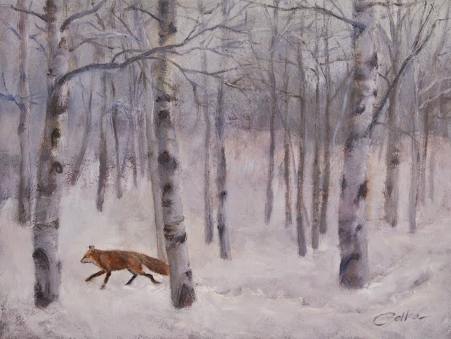
The use of grays in a painting does not need to be dull and boring. The proper use of gray makes the accent colors really sing. Sometimes paintings that have too many intense, bright colors just look too garish. It is best to mix your grays with complimentary colors you are using in the painting. Some artists will mix their left over colors up in a gray for safe keeping later. Winter Fox 9" X 12" The painting of the fox in the forest I used a complimentary scheme of yellow and purple. The colors were muted down using those two compliments into a range of grays. Senator Nelson Wilmarth Aldrich Anders Zorn 1913 From the book: ‘Anders Zorn; Sweden’s Master Painter’ , I scanned a few of his paintings that had extensive grays. Fish Market in Saint Ives Anders Zorn 1888 Summer Vacation Anders Zorn 1886

Painting Snow

Image
In progress, on the easel, is this snow challenge. The snow was fresh when I took the photo references. Fresh light power snow reflects light on the surface and into the subsurfaces. The shadows reflect the sky color, blue in this case. In cloudy days the shadows are grayer, there is more sun than dark clouds here. Overall, the snow picks up the colors that surround it. I went with a warm red underpainting for contrast and bits of that peak through here and there. 

Frosty Morning

Image

Life's Journey

Image
As an artist looking over a retrospective of one's work; it is easy to see a recording or journal of my life. To me it is not a mystery. I want the viewer to become a participant in the work relating to it in their own way through their journey in life. Photography plays a bigger part in my art than just a tool to use for painting references. My photographs are also my art. He will give you another Helper,...the Spirit of truth. John 14:16-17